There is a slightly over exposed light on the left hand sight which makes the femme fatle look like so called victim and the lighting really makes the smoke stand out. They may have some filler lighting on the sides along with back lighting.
Low-Key Lighting.
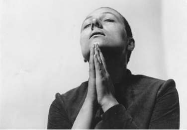
there is only one light which is coming from the top making the protagonist look ghost like. There are signs that show maybe some filler lights were added e.g the wall on the left hand side has a reflection.
High-Key Lighting.
this image has a really clever concept the use of all three lights filler lights and back light but no lighting from the bottom as you can clearly see some shadows on his eyes which show that the image is not fully optimised with light. This technique is used to make the protagonist look more evil or powerful.
Low-Key Lighting.
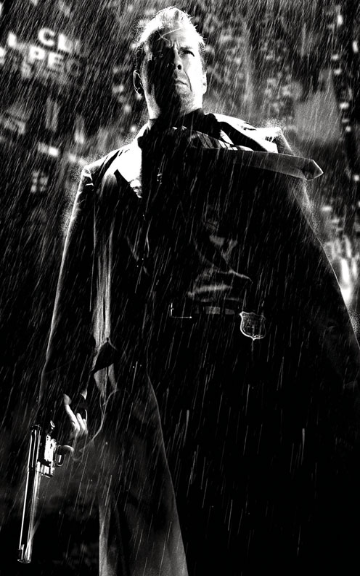
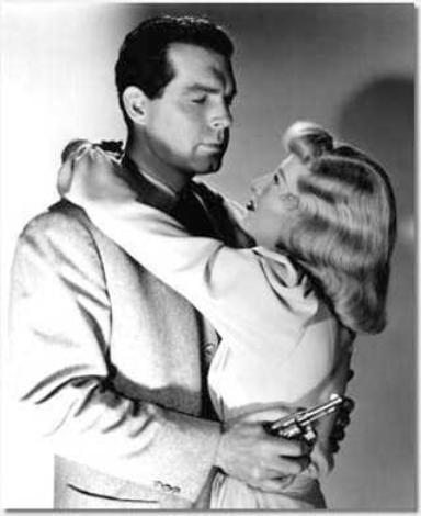
There is alot of backlighting in this image as you can see the outline of the protagoinists jacket/coat is visible making him look superior. there are some filler lights e.g there is some light on the inner side of the gun which could suggest that this film has viloent elements as they have clearly made it cisible. the rain feature is really rare using nature as a canvas which acts as a light source is fantastic.whereas now days we have really powerful and
Low-Key Lighting.
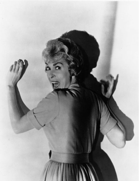
there is a big cast of a shadow on this image which makes it look realistic as its in black and white. we could tell that this particular image is from Oldern films as they may have struggled with using stronger lights in their production whereas nowadays we have stronger lights which makes a huge effect on the image. the use of filler lights is effective as you can see her face. there is no backlighting which creates that shadow effect.
High-Key Lighting.
This image is really cleverly taken as they use a natural source of light coming from the sun/daylight which casts a lined light effect and makes the protagonists seem more natural. This effect makes the image look really realistic.
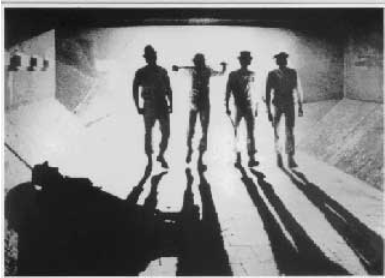
The only lighting in this image is back lighting as we can see an over exposed background and there is no light at the front creating a cast of shadows of people which makes it really mysterious. the lighting almost gives the image a sketch look as if its hand drawn as the light makes them look like pencil shadings.
Low-Key Lighting.
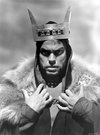
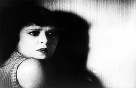
The light pans inwards from the left hand side creating a huge shadow against the wall hiding half of the protagonists face making her look innocent the acts of a victim.
High-Key Lighting.
This image has a lot of top lighting which shines on the protagonists face as he is looking upwards so they may have decided to make his identity more visible as his eyes are also closed. There is no filler lights creating a shadow on his neck.
Low-Key Lighting.
The light creates a abstract design on the wall making it look really modern and realistic the use of urban colours is used. the protagonist dosen't have much light towards her but you can see her body as the colour is slightly different to the background making her stand out.
High-Key Lighting
There is top key lighting used to make the couple appearance more visible the idea of having shadows against the wall makes the film look like it has love scenes as they are not mainly shown but the shadow effect makes it look dramatic along with the filler light on the left hand side.
ALI G Indahouse is a comedy film. ALI G dresses up in a funny manner making him stand out in the crowd. The car in which he is driving is unique as its upgraded and has text on it. This film intro has a lot of settings in various locations making it a more of a adventurous and realistic. The film is also shot in an local area stains. The film shows how life is like with being a gangster which ALI G Interprates and what he has to do to save stains. It shows how a gangster had a huge responsibility in peoples lives and also shows how he would view it.
SPY is a comedy movie. i decided to choose this specific clip because Jason Statham plays a really funny role in this specific part of the movie. The setting is quite dark with just a light focuses on his face as he says his line. He is portrayed to be really aggressive but he's actually not.
This photo is from the movie blue streak the main protagonist in this photo is Martin Lawrence. the Mise-en-scene is clearly shown as he is wearing a FBI jacket which tells us that he is undercover and he's holding a gun towards the camera. The setting is bright/outdoor in an rural area.
1)This film poster has a futuristic theme to it making it highly visible to the audience eye as there is a range of neon lights. we can clearly identify the protagonist he/she is portrayed as an important figure in the poster 2) The genre is Science Fiction we can clearly identify this as there are some sort of aircraft/UFO above the building which could mean this film has something to do with extraterrestrials or alien activity. 3) I think that this is mainly targeted to a teenage audience aged between 15-30 as we can clearly tell that there will be scenes of violence.
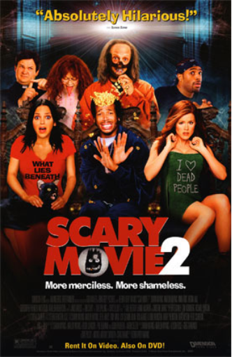
1) i can clearly identify that this movie is a horror/parody as the title of the film says the word "Scary" which makes it quiet obvious its a horror but the thing that makes this poster unusual is the text above states "Absolutely Hilarious" which basically plays with peoples state of mind. 2) there is a twist of genre we could tell by the characters expressions and what they are wearing makes it really obvious as it has description on the t shirts e.g the girl on the left. 3) looking at the film poster it seems as if the film is not a strong horror so the age range could be around 15-40 as there is elements of fun and laughter.
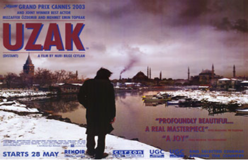
1)looking at this poster i could tell that this film is more of a serious film or a reality film. It seems as if the city is corrupted or abandoned or been in aftermath of a tragic war. 2) i think the film is more of a dramatic type perhaps of a drama genre as there is signs within the poster e.g: the poster has been saturated and the colour has been slightly extracted creating a dull atmosphere. 3) i think this film is targeted to the elderly as they may have experienced the outbreaks of war or the could somehow relate as the protagonist in the poster its proven that elderly people enjoy reality films.
1) this film poster has a range of techniques used to grab the audiences attention and make them wonder of what is going on. The boy in the middle of the poster seems quite confused or lost the expression on his face could symbolise a lot of meanings. it seems as if the boy has discovered something in a deep hole of some sort. by looking at this i could tell its an adventurous film. 2) i think that this film is a thriller as the title is slightly distorted and states "Im not scared" yes there is fire within the typography which could suggest that there are things to be afraid of in this film. 3) i think the target audience for this film is 15-25 as the protagonist look like a teenager so watching this outs the audience in his shoes.
1) This film poster has a modern look to it i could identify this by looking at the colours used e.g black grey these are urban colours. the thing that makes this poster stand out is the title as its in a fresh colour format which basically highlights the entire poster making the audience read the title first then gradually moving upwards to the main protagonists. 2) this film is defiantly an action i am strongly confident that it is as there is only signs of action e.g the props used like the gun which is really common in action movies nowadays are there is a lot of fights and chases. 3) due to the lack of imagery i could tell that this film is for mainly adults aged between 18-35.
1) This film poster is really engaging as it uses various graphical techniques to enhance the appearance and gives the audience a bit of a narrative by the use of imagery. 2) Johnny Depp is the highlight of this film as he is known for starring in action films being the main protagonist for younger audiences i think that this film is suitable for families 3) I think that this film is targeted for kids and teenagers as its more likely to be a PG FILM.
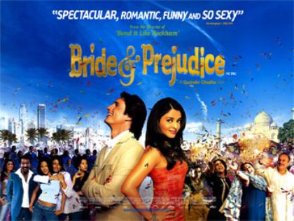
1) this film poster has a range of colours which could symbolise happiness. the description at the top gives it away what the films about. there is a lot of culture within this poster showing two very different cultures from both protagonists. 2)i believe this film is a comedy as there is a lot of laughter and celebration. 3) i think the target audience for this film is 18-60.
1) this film poster consists of a dark atmosphere which could symbolises a lot of tragic situations. 2) this film is more likely to be a action/drama 3) i think this film poster targets an audience between 18-50 as it could be suitable for mothers who have babies.